MetricsCart
Digital Shelf Analytics Platform
Responsibilities
Sole designer of a quick-commerce digital shelf analytics product. Designed and built its marketing site for conversion and brand alignment.
Context
MetricsCart is a digital shelf analytics platform. The original product covers regular e-commerce. Quick-commerce is a separate product for brands tracking SKU performance on Blinkit, Zepto, Instamart, and similar 10-minute-delivery platforms.
The Product Owner handed me a doc: KPIs, features, data structure. My job was making it useful. As the sole designer, I designed every screen, interaction, and visual pattern in the product. Approximately 30+ hi-fi screens covering dashboards, tabular views, geographic drill-down across multiple zoom levels, and the expand workspace.
The team: 1 PO, 1 product analyst, 5 to 6 engineers.
Who I designed for
Three user types share the product. They use it for different jobs.
| User | What they do | What they need |
|---|---|---|
| Brand managers | Track their own SKUs across retailers. Need to spot anomalies and explain them internally. | Fast scan, clear visual signals, presentable views. |
| Agencies | Manage portfolios across multiple brand clients. Pull views into reports. | Same as above, plus easy switching between brand contexts. |
| Researchers | Analyse category-wide trends. Slice data, compare segments, export. | Flexibility, raw data access, deeper filtering. |
This shaped three of the four decisions that follow.
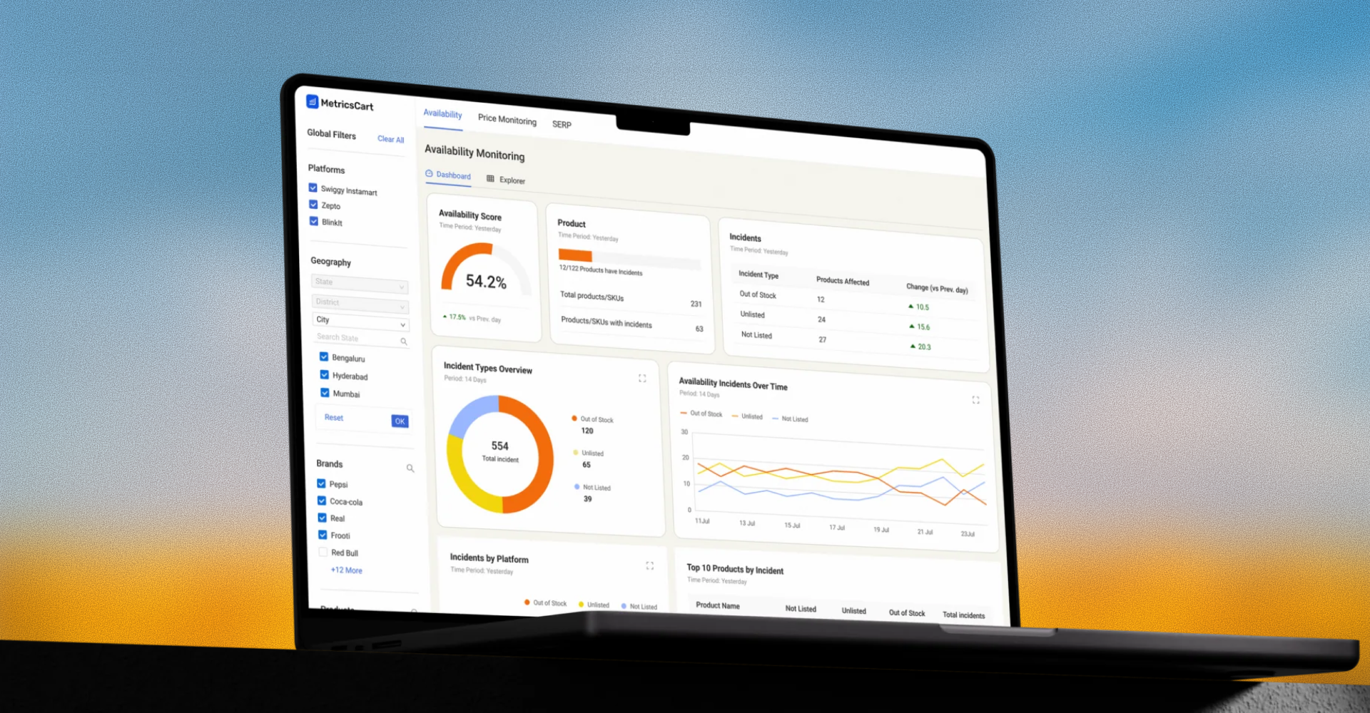
1. Two views, one switch
The spec was rich. Many filters across many dimensions. Multiple chart types. KPI cards. Dense tabular data. Without strong structure, a product like this fragments. Every screen feels like a separate tool.
I designed it around two views of the same data: a dashboard for scanning, and a tabular view for inspecting. One switch at the top moves between them. Everything else lives inside one of those two views.
This serves all three user types. Brand managers and agencies live mostly in the dashboard. Researchers live mostly in the tabular view. Both groups can move between the two when they need to. One switch, one mental model.
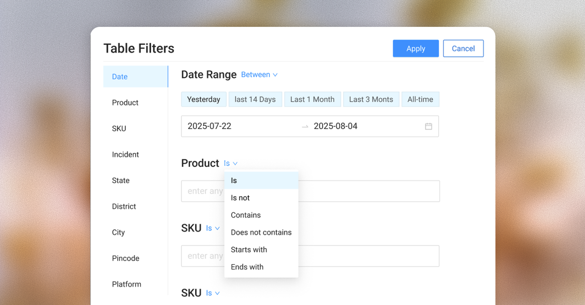
2. How filtering should work
Inside the tabular view, users can filter by any column. I considered two patterns.
The first was a chip-based filter with operators (e.g., Brand IS Coca-Cola, Retailer IS NOT Blinkit). Flexible, demos well, has a learning curve before users get value. I built it out at mid-fi to evaluate it properly.
The second was standard column filters: click a header, pick values, apply. Familiar from spreadsheets and BI tools. Less expressive, immediately usable.
I shipped column filters. The decision came down to who would use them most. Brand managers and agencies use the tabular view occasionally, and column filters are immediately legible to them. Researchers, who spend more time here, would eventually outgrow column filters, but the gap is a v2 problem, not a v1 blocker.
The chip pattern I explored before deciding on column filters.
3. The expand interaction
Charts on the dashboard are scannable but limited. A user spotting something interesting wants to dig in. Change the time period, slice the data differently, see the underlying products, all without losing where they are.
The spec called for an "expand" affordance on each chart. What that should feel like was the design call.
I designed expand as a focused workspace rather than a simple popup. Clicking expand opens a full-screen surface containing two things: the chart itself, now interactive with period filters and dimension toggles, and the underlying table beneath, with its own column filters.
The user can iterate on either layer. Change the period on the chart, the table updates. Filter the table, both layers reflect the constraint. Both are visible together, both are controllable, neither is hidden behind a tab or another click.
This pattern serves brand managers especially. They're the ones most often pulling on a thread from a chart. The dashboard sits underneath, dismissible with a close. Their place in the product stays intact.
4. Designing the geographic drill-down
The product uses geography heavily. Incidents tracked across country, state, district, and city levels. This was the most layout-intensive view to design.
I designed the geographic view as a map that changes representation as the user drills in:
- Country level: a choropleth map of India, with red gradient indicating incident density per state.
- State level: the same gradient at district granularity.
- City level: bubble representations, with size indicating incident count.
Each level shows the geographic visualization on top and the relevant tabular data below. Users drill in by clicking a region, out by clicking the breadcrumb. Filters from the dashboard top bar persist across levels.
The hard part wasn't any single level. It was making the transitions between levels feel like one coherent system rather than separate views. I held a rule: the map's position, the table's position, and the filter state's behavior stay visually constant across drill-down levels. Only the granularity changes.
The marketing site
I designed and built the marketing site in WordPress with Elementor. The original was feature-led. I restructured the IA around solutions, the problems users come in with, and rebuilt landing pages around a clearer demo-request path.
Result: CTA clicks went from ~500 to ~8,000/month (≈16×). 12 qualified demos per month, versus zero before launch. These conversations now feed customer discovery on the product side.
Let's
connect
I'm always open to discussing product design work or partnership opportunities.